

Help pick The Midst logo
We're building our brand and we need your help. Which of these five options do you like best?

Hello GALs! You’re invited to help build the future of The Midst.
Our editorial team has narrowed down options to these five. Now we want to hear from you — which logo do you like best?
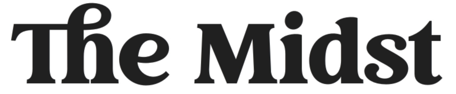
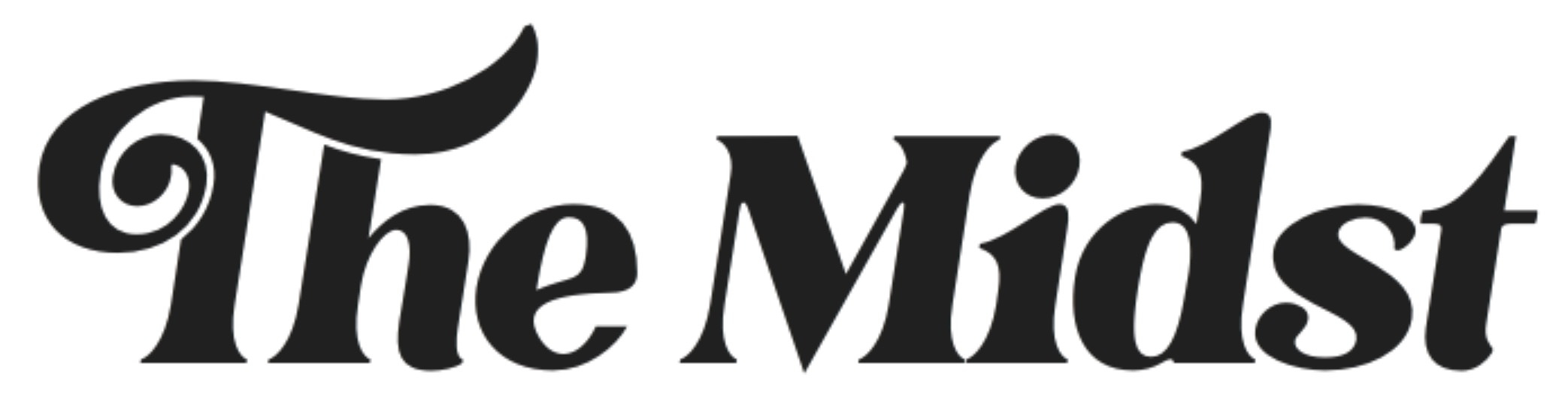
Option 1:
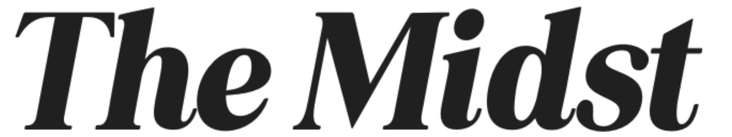
Option 2:
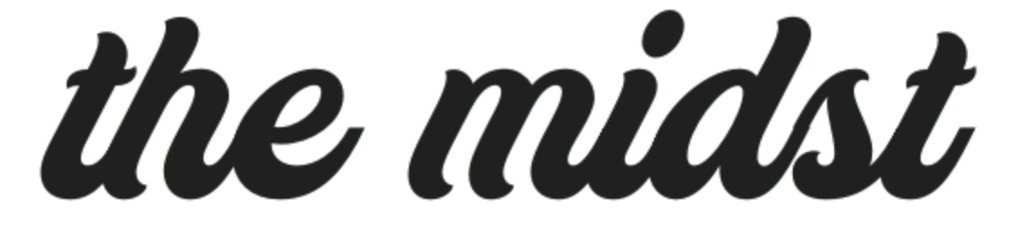
Option 3:
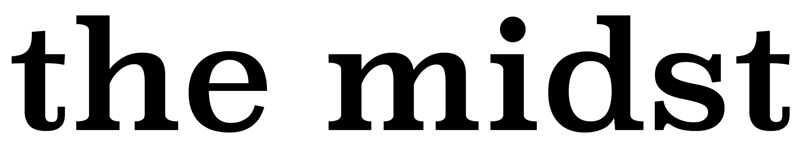
Option 4:
Option 5:
You must be a Midst Substack subscriber to vote. Sign up now for a free The Midst subscription if you haven’t done so yet!
Thanks for voting! We’ll announce the winning logo in an upcoming edition of The Midst Weekly newsletter.
P.S. You’ll likely see one or several of these options around our the way in our Midst Substack. Don’t let those placeholders affect your vote. We don’t personally have a favorite.
Thank you so much for the additional feedback, Linda! And we appreciate your support greatly.
The first one is my favorite because it is on the efficient frontier of clean and unique. My second favorite is the fifth, but I feel like the flourish on the T overpowers the rest of the logo a bit too much.